Toning (Part I)
02nd July 2020
Toning of black and white prints began in Victorian times with the idea of making the silver compounds that make up the image more stable. Gold and selenium toning for example vastly improve the longevity of a silver halide print. Those are expensive choices and involve toxic chemicals, so sepia toning became the popular choice. Plus the act that sepia gives warm soft brown tones which are quite attractive as against the cool blue tones of selenium. That said I quite like those cool blue tones done lightly.
Toning soon became a creative choice. A sepia toned image is attractive, especially with portraits. Toning fell out of favour in the second half of the 20th century – certainly I don't recall family photos from that time that were toned. My father who took a lot of photographs in the 1950s to 1970s produced good monochrome images and later colour transparencies. Fashions change and colour gained the market. And why not, it was new, the future and people wanted their colour memories, well, in colour.
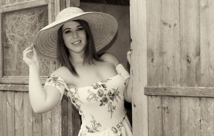
Sepia tone
So the question is why has toning become popular once again? By popular I don't mean mainstream, but more people do have a go. Look on photo websites and toned images crop up here and there quite regularly. I's easier to create toned images in software but just because the method is available doesn't mean it has to be used. 1980s tobacco graduated skies anyone? Like putting chilli sauce on your cornflakes. OK, some might! But it's good to see people experimenting with and using the technique.
Thus it has to be a creative decision. Some photographers make it part of their style. While monochrome images are an abstraction of reality, to make an impact on the viewer you need an appropriate subject (see my earlier blogs on that topic) and for toning you need that colourisation too work with the image. Think of sepia for rural scenes and blue for cold modernist architecture. That's by no means meant to be a rule, and the opposite may well work.
When deciding to create a toned image, I first create a good colour original. I then make a black and white conversion, adjusting the colour components individually and tweaking contrast as necessary. Ifor more on that seen my Black and White blogs from last year. Adding grain and dodging and burning are applied as I feel fit. So I'm starting from the best possible point, just as I would have done if I was processing in the darkroom (except if I mess up here I haven't wasted paper and chemicals). I then apply the toning. So the digital workflow in terms of creating a good black and white image first is in principle the same as a chemical workflow.

Selenium tone
I have an idea what type of toning I'm going to use at the outset. However, I do try other toning types – they may be very pleasing. For example, I may prefer a copper tone to a sepia tone. Subtle differences. In Photoshop and Affinity you can choose the colour tone you want and its strength. With the Nik plug-in there are numerous toning types and the strength of toning can be controlled as well as the paper tone. So a multitude of possibilities. One option is Cyanotype which isn't a toning technique but an image processing method in itself albeit one that produces cool blue tones.
Next time I'll look more closely at my toning methods.
All text and images © Keith Rowley 2020
Toning soon became a creative choice. A sepia toned image is attractive, especially with portraits. Toning fell out of favour in the second half of the 20th century – certainly I don't recall family photos from that time that were toned. My father who took a lot of photographs in the 1950s to 1970s produced good monochrome images and later colour transparencies. Fashions change and colour gained the market. And why not, it was new, the future and people wanted their colour memories, well, in colour.
Sepia tone
So the question is why has toning become popular once again? By popular I don't mean mainstream, but more people do have a go. Look on photo websites and toned images crop up here and there quite regularly. I's easier to create toned images in software but just because the method is available doesn't mean it has to be used. 1980s tobacco graduated skies anyone? Like putting chilli sauce on your cornflakes. OK, some might! But it's good to see people experimenting with and using the technique.
Thus it has to be a creative decision. Some photographers make it part of their style. While monochrome images are an abstraction of reality, to make an impact on the viewer you need an appropriate subject (see my earlier blogs on that topic) and for toning you need that colourisation too work with the image. Think of sepia for rural scenes and blue for cold modernist architecture. That's by no means meant to be a rule, and the opposite may well work.
When deciding to create a toned image, I first create a good colour original. I then make a black and white conversion, adjusting the colour components individually and tweaking contrast as necessary. Ifor more on that seen my Black and White blogs from last year. Adding grain and dodging and burning are applied as I feel fit. So I'm starting from the best possible point, just as I would have done if I was processing in the darkroom (except if I mess up here I haven't wasted paper and chemicals). I then apply the toning. So the digital workflow in terms of creating a good black and white image first is in principle the same as a chemical workflow.
Selenium tone
I have an idea what type of toning I'm going to use at the outset. However, I do try other toning types – they may be very pleasing. For example, I may prefer a copper tone to a sepia tone. Subtle differences. In Photoshop and Affinity you can choose the colour tone you want and its strength. With the Nik plug-in there are numerous toning types and the strength of toning can be controlled as well as the paper tone. So a multitude of possibilities. One option is Cyanotype which isn't a toning technique but an image processing method in itself albeit one that produces cool blue tones.
Next time I'll look more closely at my toning methods.
All text and images © Keith Rowley 2020